15 min to read
Color Psychology: How can you use them effectively in Marketing and Branding?
Color Psychology.
Color represents a large part of your branding, and therefore, it is an enhancing aspect of your marketing.
What is the first thing you think of when we talk about a big yellow "M"? You probably instantly thought of Mcdonald's.
Or, for example, what color do you associate with Facebook? Blue, correct?
Beyond this, in a Digital Synopsis article, we found that 93% of buyers focus on the visual aspect of products, and color is one of the most relevant characteristics, with 84.7% of users saying that this is the primary draw card when they make a purchase.
It's right there where the theory of color psychology comes from. Today at Codedesign, we want to dive deeply into this subject to see how you can use it to your advantage within marketing and branding efforts.
So sit back and enjoy this article.
CodeDesign is a leading digital marketing agency ranked #1 in Lisbon, Portugal. You could work with us to accelerate your business growth.
What is Color Psychology?
We can adjudicate the first color psychology theory to the German poet and artist Johann Wolfgang von Goethe in 1810. In his book "Theory of Colours," the artist stated that different colors could evoke various emotions in individuals, describing, for example, yellow as a "gladdening" tone and blue as a "melancholic" one.
Although the scientific community rejected this theory, in 1942, Psychologists Kurt Goldstein expanded Goethe's work by conducting experiments on five patients to see how specific colors could affect their motor function.
The experiment looked at different red and green objects to see how they could affect their balance problems and tremors. The results showed that red seemed to increase their symptoms while green decreased them and improved their overall motor function.
After this experiment, Goldstein concluded that red was a stimulating color while green would be a stabilizing one, and he argued that his patients could improve their state just by seeing the color.
Scientifisists weren't the only ones studying this theory, as famous psychoanalysts like Carl Jung strongly believed in color psychology and how this affects our emotions and feelings. In the words of Jung, "Colours is the mother tongue of the subconscious."
Bonus Fact:
Even before scientists, psychologists and, of course, marketers debated on Color Psychology, two ancient cultures, named the Egyptians and Chinese, they documented using the art of chromotherapy to heal their people.
Egyptians built complete rooms for color healing, where, through a colored rubi and the sunlight, they tried to heal their citizens.
Meanwhile, in China's case, this ancient culture used color to indicate cardinal directions, seasons, and the human body's internal organs. They described color as cosmic energy - called chi'-which then could shape power and destiny.
As marketers, we seek to know how we can use psychological tricks to make our customers buy, that is the basis of our discipline, and that is why we get ideas about colors and how they could be adapted to our brand. If you need more help with building your brand, or even rebranding it to give it a new air, contact our team of digital marketers to help you.
This issue is of such importance that in the "Impact of color on marketing" study, researchers found that up to 90% of snap judgments made about products can be based on color alone.
So we could take color and its psychological meaning as a guiding light to build our branding. BUT - and this one is big - there is a misconception about this theory, and if you want to master it, or at least manage it to a certain degree, there is something you need to know.
The Cultural Perception of Colors
So, although we want to determine that a color could generate the same feeling for all customers, this idea may be a little simplistic.
What could make the scientific community raise an eyebrow in distrust of this psychological theory is that the experience of colour depends on personal experiences, even on the cultural spheres of each society, as a study by the National Library of Medicine points out.
In specific contexts, we can assume that red is associated with anger since we usually take on this hue when we get angry. But in another field, red is associated with love or medicine.
Our ideas about colors vary greatly depending on our culture or upbringing.
For example, while we Westerners can associate black with death, in the Far Eastern, it takes on the opposite meaning, representing health, prosperity and hospitality.
In the following graph, courtesy of a Bootcamp.UxDesign article, we can see what meanings are given to each color according to culture:
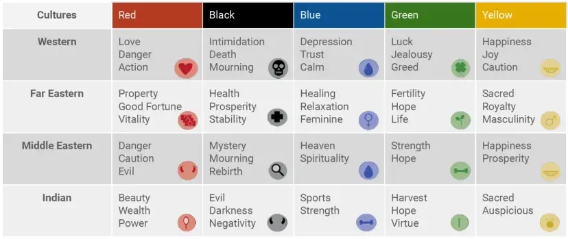
Observing this, we should not throw in the towel and think that the psychology of color is useless for our branding. This topic is quite relevant for brands, and there is much cloth to cut to use in our favor.
How to Use Color Psychology for Marketing?
As we stated earlier, choosing a tonality for your logo, website, and all other branding and marketing pieces is not as easy as looking for a color chart, finding the one that "conveys" trust and reliability and suddenly stamping it everywhere.
Your brand's feelings, mood and personality require a little more work. However, there are several things about the color psychology that can help you.
Choose a Color that Combines with your Brand.
This part is an intuition exercise as you'll pick a color that fits your niche, and everything goes down to your experience with colors.
If you are a Vegan restaurant, chances are that you'll choose green tonalities, as this goes well with brands that try to be eco and animal friendly.
This part of a brand building may be a sketch, as with the following tips, you could drastically change your choice or even spice it up with more colours.
Choose a Color that Fixes your Brand's Personality.
As we mentioned above, colors can affect purchasing intent from your customers. Nevertheless, the most critical thing isn't the tonality itself but the personality you want to portray with them.
Jennifer Aaker, a Psychologist and Stanford professor, conducted studies on "Dimensions of Brand Personality," and in its paper, she points out five dimensions for a brand's personality:
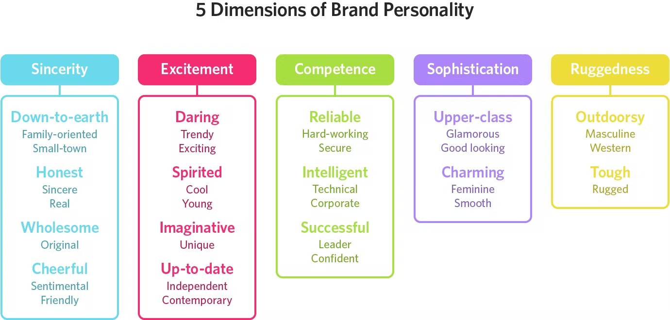
Once you figure out what you want to convey with that personality, chances are that you'll find a color mix, textures and designs that show your brand's personality.
To build your brand's personality, you can start by defining your business purpose by reading our article. Also, look at the The role of creativity in digital marketing.
The Proper Color Appeals to Your Audience.
Knowing your audience and their preferences will help you better choose the tonalities that best suit their tastes.
Depending on their age or gender, or also depending on your niche, the tastes for each shade will change. Here we give you a list of the preferred colors for each age group and gender according to Vengage:
Kids 2-10 years:
- Male: Artic Blue, Lime Green, Ambar Yellow.
- Female: Cupid Pink, Lavender Grey, Tiffany Blue.
Teenagers, less than 19 years:
- Male: Charcoal Black, Demin Blue, Splashed White.
- Female: Jade Black, Crimson Red, Tangerine Orange.
Young adult, 20-30 years:
- Male: Caroline Blue, Quartz Silver, Hickory Brown
- Female: Sand Gold, Cherry red, Eggplant Purple.
Adults, 30-40 years:
- Male: Oxford Blue, Powder Blue, Earl Grey
- Female: Dull Magenta, Emerald Green, Heather Purple
Middle Aged, 40-55:
- Male: Pebble Black, Misty Grey, Smokey Teal.
- Female: Apricot Pink, Pine Green, Pantone Plum
Senior Citizens, 55+:
- Male: Suave Mauve, Pale Beige, Snow Blue
- Female: Frosty Lime, Crepe Pink, Candle White.
Use the Right Color to Differentiate Your Brand
In a Help Scout article, we found a study that reveals that our brains prefer instantly recognizable brands, so color represents an essential element when you create your brand. A journal article suggests that if you are a new brand, you should pick a rare color within your niche to differentiate from competitors. This tactic is backed up by the psychological principle known as "the Isolation Effect," which states that if something "stands out like a sore thumb," it augments its chances of being remembered.
Choose a Color with a Catchy Name.
We saw a common trend when we looked at the color preferences by age and group. We don't find typical colors like blue or green; instead, they are more specific and fancier if you like them, so we have denim blue and emerald green, for example.
The thing is that although we all perceive colors differently, the name of these can have different effects on consumers.
In the study "A rose by any other name ...," people evaluated products with different color names, such as makeup items, and those with fancier names were preferred.
For example, there is a different effect when we put "mocha" on a product instead of just "brown," although they can be the same tone.
A study on "Color and Shopping Intentions" found that this name colour effect also applies to various products because they are more pleasing to the eye than their essential colour names.
Choose a Color Palette for Your Brand.
If you have trouble choosing colors or even know how to combine them, then a color palette is a suitable tool to help you with this.
This aspect has to do more with graphic design aspects, but in essence, there are three common ways to combine colors for your brand:
- Analogous: Colors that are next to each other in the color wheel.
- Complementary: These tones are opposite and create high contrast.
- Monochromatic: Various shades of the same tonality.
Try A/B Testing.
If you have some combinations or options that look fine but need to know if your audience will love them, then A/B testing is an excellent option. You create two options of the formats you want to use in your brand, and then, through data analysis, you can see which of them they like the most. To learn more about this, read this article.
The Psychology of Colors in Marketing.
Now with these tips in mind, it is a great idea to check out the most common attributes for each color and see how we could use them or even mix them to create the right personality and an excellent image for all our branding and advertising. For this, we'll take some references from the article Digital Synopsis.
Let's analyze these colors.
Red

-
It encourages appetite. Fast food franchises like McDonald's use it.
- It creates a sense of urgency, an alarm.
- Red is a special color for CTAs or the "order now" button since it remarks more on the message, and you can mix it with white or black letters to outline the message.
- It emanates high energy and gets attention.
- It stimulates the human body, raising blood pressure and heart rate.
Feelings:
- Love
- Power
- Lust
- Excitement
- Speed
- Anger
Brands Using Red:
As a color represents so many strong emotions, there's no doubt why so many brands use it to persuade people subconsciously.
First, we can address the food topic by remarking on how many fast food brands use it to open customers' appetites. We have McDonald's, Coca-Cola, KFC, Budweiser, and Redbull on the vast list.
Now, why do we associate hunger with "red"?
As the color of love and hate, it moves our emotions deeply and also alerts us to buy and consume now. It's like a red light of emergency, but the emergency may be more that you want to eat hamburgers ASAP.
Now red is also associated with adventure and adrenaline - sometimes, when we get angry, we turn ourselves red - and because of this, brands that want to convey an adventurous style, like Ferrari or Puma, pick this tone to give this energy to users.
Finally, in the broadcast and technology niche, we got brands like Netflix, CNN and YouTube that may use this color to make people consume content as fast and as much as they can. If you want to learn more about red as a tone, we recommend you read this Scientific American article.
Orange

- Cheerfulness and optimism
- While yellow can make babies cry, orange can show caution
- It's an excellent option to draw impulsive buyers and window shoppers
- Stimulates logic and enthusiasm
- If you use it too often, it can create a feeling of anxiety in users
Feelings:
- Ruggedness
- Excitement
- Creativity
- Enthusiasm
- Success
- Balance
Brands Using Orange.
Orange is a lighter shade of red, conveying most of the same feelings as its primary color cousin.
Nonetheless, orange may be more friendly and warmer than the feelings of anxiety or strong emotions that red generates, and its use in marketing goes to many niches. And no, it isn't just orange juice brands.
On one aspect, orange still holds an adventurous feeling, which is why brands like Harley-Davidson and Timberland use it.
Also, according to "The Psychology of Orange Branding," this tonality can give a feeling of affordable yet, high quality, and that's why Amazon uses it. On the other hand, this warmer tonality can make us feel at home, and that's why Home Depot picked this.
Then, on the fun and creative aspect, we found the famous cartoon channel Nickelodeon.
Yellow
- This color revolves around happiness. It has a clear relationship with the sun.
- It could sometimes mean warning or precaution, just as the yellow signals on the streets.
- Depending on your website's color scheme, yellow can also be a good option for your CTAs.
Feelings:
- Happiness
- Positivity
- Summer
- Optimism
Brands Using Yellow.
Among the companies that prefer this color, we can see that they come from different niches—for example, McDonald's in the food area and Best Buy in another spectrum.
Regardless of this, the thing with yellow is that it is a great attention grabber, which may be why these brands choose it to jump right out on users' attention.
Nonetheless, yellow can be difficult for designs as too much can be exhausting for viewers. If you want to use it for your logo, that's great, but never try to place it all over your web design. Your page will shine, but not in a good way.
Pink

- A color that gently represents love.
- Most famous for female audiences
Feelings:
- Feminity
- Tenderness
- Vulnerability
- Youth
- Innocence
- Hope
- Naive or silly
Brands Using Pink:
While, according to today's standards, men are more open to wearing pink in their clothes, it's fair to say that its use in marketing is still highly feminine.
If you look at anything about Greta Gerwig's "Barbie" movie is astonishing they painted all of Barbieland with the specific "pink Barbie" tone, and according to CNN, this movie used so much pink paint that there was even a global shortage of this product. As a girl doll and a collection item, it's easy to understand how pink fixes to Barbie's branding with values of love, hope and feminity while also managing a feminist message for their audience that girls can be what they want.
On the other hand, Victoria's Secret uses this color with a little black mixture, which could mean the "seductive" aspect within lingerie. The brand itself also has another division called Pink.
Purple

- Royalty, wisdom and respect
- This color stimulates the problem-solving and creativity areas of our brains
- Beauty and anti-aging brands tend to use it
- Represents a creative and wise brand
Feelings:
- Power
- Royalty
- Luxury
- Wisdom
- Spirituality
- Sophistication
- Warmth
Brands Using Purple:
Did you know that purple was the color of royalty due to how difficult was to produce it for textiles?
Famous religious figures like Jesus Christ Nazarene dressed in this exotic color, and even Queen Elizabeth I banned the shade from everyone outside the royal family, but what about brands?
While we can associate this color with beauty products or daily care for ladies, like Ladies Speed Stick deodorant, the world of candies and chocolates has used it well in its presentations. Two good examples of this trend are Milka and Willy Wonka. On the one hand, Milka is more of a high quality and gourmet style of chocolates, while Willie Wonka tends to play with the extravagant and weird personality of the famous character.
Nonetheless, some companies avoid this shade as "being the royalty" can feel a bit outputting for customers since most of us don't feel identified with this high class.
Blue

- It's the most preferred color by men
- Security and trust
- Most common color used in offices and conservative brands
- Tranquillity and space, a calm mind.
- Young people associate it with maturity.
Feelings:
- Sophistication
- Competence
- High quality
- Corporate
- Reliability
- Sea/Sky
- Stability
- Depression
Brands Using Blue:
Blue may be the most popular primary color, and we look at this tonality in many niches and repetitive times. This primary tone even showed to be the world's favorite color, with 57% of men and 35% of women ranking it as their favorite, Live Science informs.
First, going to technology, we have Facebook and Skype - we could say Twitter, but it's now X, and no, it isn't blue. Since most social media platforms like Facebook work with most of our personal information, there is a high reason why they want to be seen as a professional and trustworthy company.
On the other hand, blue fixes well with healthcare products and dairy products like Oral B because we associate the idea of this tonality with clean water.
Green

- Health, tranquillity and nature. Although, poison can be associated with it too.
- Money and wealth.
- Stores use it to make customers relax
- Brands use it to address environmental issues
- Green stimulates harmony in the brain, balancing the mind and body
Feelings:
- Envy
- Economic Wealth
- Health
- Good Taste
- Eco-Friendly
- Growth
- Fertility
- Generosity
Brands that Use Green.
As the color of life and nature, we can guess that there are thousands of eco-friendly brands that use green as their best choice.
Nonetheless, this one has reached the spectrum of nature and ecological life, as Spotify and WhatsApp adopted it as their branding personality. Now, this is an important part of color psychology; color shades can give another feeling from the original one. These two technological brands choose a more vibrant shade of green that could provide a subconscious message of future and innovation.
A warmer color or a more fluorescent one can change meanings effectively.
Black
- Authority, power, strength and stability
- It's a symbol of intelligence
- If it's used too frequently, it can overwhelm people
Feelings:
- Expensive
- Elegant
- Unapproachable
- Fear
- Sophistication
Brands Using Black:
Once again, black is a great winner among the number of brands that use it in their logos.
This tonality specifically has more engagement within the clothing industry and tends to be associated with luxury or high-value products. Examples are LV or Prada; on the sports apparel, we also have Nike and Adidas.
Besides, black is an excellent compliment to many logos as this color goes well with almost every other combination and remarks the tonality of the other tone.
Brown.

- The color of the earth
- Suitable for brands that have to do with the woods or the mountains
Feelings:
- Homemade
- Local
- Old school
- Masculinity
Brands Using Brown.
Brown is a color that chocolate coffee brands prefer. Good examples of this are M&M's, Hersheys and Nespresso.
As the color of earth and trees, brown tends to give an air of "home" or a safe place, and because of this, many homemade brands like to add it to their branding.
Grey

- Practicality, timelessness and solidarity in life
- Too much grey could lead to a feeling of nothingness
- Although it is an exciting color, it could lead to feelings of depression or old age death
Feelings:
- Authority
- Luxury
- Neutrality
- Balance
- Depression
- Loss
Brands Using Grey.
It could be that grey has some "negative" connotations, but this could be more of a "plain tone grey" that exhibits these low energy feelings; if you put a metal touch to that tonality, it becomes more of a silverish color, and that one shows more luxury and authoritativeness.
Let's take, for example, Apple, the giant smartphone brand that makes many users feel more accomplished. That grey apple shows power, it shows users that they're paying for something classy and high quality, and while many other smartphone brands could have even more exciting features, consumers are still falling into Applemania.
When we go to the automotive industry, we see that brands also use the metallic grey shade to show that their cars are something only worth luxurious people, for example, Mercedes Benz.
Grey is the in-between to black and grey; from good and bad, light and darkness, this color stays in the middle as something calm and Ethereum.
White
- It can spark a sense of creativity if customers associate it with a clean slate.
Feelings:
- Sincerity
- Purity
- Spirituality
- Humility
- Sterility
- Cold
Brands Using White.
As a hue, white suits better for the font of your logo. We see this in Coca-Cola, KFC, and YouTube, among others.
Its combination with its counterpart, black, adds the same elegance that we can see in brands like Dior, Chanel, Prada and Gucci.
When you Finally Choose your Colors: KEEP IT CONSISTENT!
Color has a recognition power even greater than words per se, it's the first thing that we visually decode and that is why it is of great importance.
In a study conducted by Reboot Online, participants were given a chart listing the color scheme for each brand. 78% of them managed to recognize the color of the brand, while only 43% could name it.
Therefore, once you have managed to choose that color scheme and that specific combination that will give all the personality to your branding, you must keep it consistent in all your platforms and channels since that will tattoo those colors in the minds of your consumers.
In this way, if we do a quick test, we can say:
Yellow + Red= Mc'Donald's.
There are probably many more brands that combine these two colors, but the fast food chain has managed to be so consistent with its psychology of color and branding that it is very likely one of the first to come to the consumer's mind. And that is the success of a good marketing campaign, getting your "symbols" or style to lead people to have you as their first thought.
To create a seamless, unique and consistent brand experience, you must learn more about omnichannel. At Codedesign, we have several articles in our topic library, take a look and keep learning:
- Omnichannel Marketing: Create a seamless customer experience across all channels.
- Omnichannel: Is your brand ready?
Final thoughts
In marketing, only some aspects should go through the careful study of all aspects of your brand. To succeed in this line, we need to take care of the professional part of our marketing but, above all, the visual aspect since it is the first thing customers will notice about our business. The colors and their combination will help you convey that image that you want so much from your brand, whether you are a new business or want to renew your energy with a rebranding. Whatever your situation, at Codedesign, we offer you a professional hand to help you empower your brand and take it to all your ideal clients, thus reaching all your professional goals. Contact us, and let us guide you in your digital marketing.

About Bruno GavinoBruno Gavino is the CEO and partner of Codedesign, a digital marketing agency with a strong international presence. Based in Lisbon, Portugal, with offices in Boston, Singapore, and Manchester (UK) Codedesign has been recognized as one of the top interactive agencies and eCommerce agencies. Awarded Top B2B Company in Europe and Top B2C company in retail, Codedesign aims to foster personal relationships with clients and create a positive work environment for its team. He emphasizes the need for digital agencies to focus on data optimization and performance to meet the increasingly results-driven demands of clients. His experience in digital marketing, combined with a unique background that includes engineering and data, contributes to his effective and multifaceted leadership style. |

About CodedesignCodedesign is a digital marketing agency with a strong multicultural and international presence, offering expert services in digital marketing. Our digital agency in Lisbon, Boston, and Manchester enables us to provide market-ready strategies that suit a wide range of clients across the globe (both B2B and B2C). We specialize in creating impactful online experiences, focusing on making your digital presence strong and efficient. Our approach is straightforward and effective, ensuring that every client receives a personalized service that truly meets their needs. Our digital agency is committed to using the latest data and technology to help your business stand out. Whether you're looking to increase your online visibility, connect better with your audience, get more leads, or grow your online sales. For more information, read our Digital Strategy Blog or to start your journey with us, please feel free to contact us. |
CodeDesign is leading:
- Digital Agency
- Digital Marketing Agency
- Digital Ecommerce Agency
- Amazon Marketing Agency

Add comment ×