6 min to read
If you’re a “click and mortar” business, you’ll know how important your website is for generating revenue. Without it, your customers wouldn't be able to do much clicking.
Just as importantly, without embracing design principles that enhance your user's experience on your website, they won’t want to click anywhere.
Much less the Call-to-Action buttons for your exciting products or services.
CodeDesign is a leading digital marketing agency ranked #1 in Lisbon, Portugal. You could work with us to accelerate your business growth.

As Google continuously updates its algorithm, things like user-friendly design is becoming more and more important. If you don’t embrace the basic principles that can take your website to the next level and boost your conversions, you may find yourself being left behind.
Utilizing some of the key design principles we’ve listed below will set you and your website on the path to improving your user experience. This will directly increase your conversions, which will ultimately boost your bottom line.
Design tips to increase web conversions and improve user experience
If your business operates online, web conversions are one of the most important metrics for you to get right. A high conversion rate means higher lead conversion and therefore increased profits.
By utilizing effective design techniques to improve that web conversion rate, you’re going to be setting your site up for long-term success. The principles below are great notions to focus on as you go about improving your website.
1. Embrace visual hierarchy
Online shopping is all about convenience.
When people browse an online store or service, not only do they want it then and there, they want it to be easy to navigate. The more confusing a site is, the more likely your potential customers are to metaphorically swipe left and find somewhere else to spend their money.
Most likely, a competitor.
Having a clean, intuitive, and logical visual hierarchy is a simple but effective way to ensure that that doesn’t happen. Take this comparison from Hubspot for example.
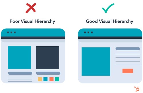
It may seem basic, but the overall idea is that simple designs with logical flows and as few elements as possible are the best way to construct a website. Good websites that result in quality conversions rely on smooth, frictionless interactions.
Some basic tips are:
- Ensure you have an easy-to-find navigation bar (top corners, sidebars or headers are popular locations)
- Utilize color contrasts to highlight parts of your navigation
- Use sticky navigation menus to make sure users never need to scroll up
Getting to know your customers and what they want can be useful when you decide how to structure your website's hierarchy. Learning how to do card sorting in ux research can go a long way towards this and ultimately improve your website's performance.
The better and smoother your website flows from one point to the next, the more likely you are to convert potential leads to future clients.
2. Use high-quality images and video
As a designer, you’re uniquely aware of just how visual we humans are.

Everything about your career is based on appealing to one of our most basic instincts. So it’s no surprise that images and videos are going to play a key role in your goals.
High-quality photos and videos are essential to increasing conversions and improving your customers' experience on your site.
These visual representations of your products or services can be the deciding factor on whether your customers make a purchase or not. Our brains analyze images in fractions of a fraction of a second, so great images are the best way to immediately make an image.
Video is the format of media that not only dominates the internet today, but it’s also the format that’s most likely to capture your users' engagement effectively.
Marketers from every corner of the world are increasingly utilizing the power of video to increase their lead generation and conversion stats.
3. Focus on minimalism and simplicity
Minimalism is one of those design buzzwords that can have you conjuring up images of empty white rooms or the saying “less is more” faster than you can say Google.
While it’s not wrong to have those links, minimalism isn't simply the absence of content, but rather using less to do more.
If you’re in a space as highly competitive as eCommerce or any online-based industry, you’ll know it’s vital to make the most of the time you have with your users.
Every piece of information, text or content should serve a purpose in order for you to get full value from it. Information overload is one of the biggest obstacles to a good user experience, especially if you’re dealing with pages that have just tagged on element after element after element.
If you can say more with less, then do so. Wherever possible, be as direct and to the point as possible.
4. Utilize whitespace
Clean, simplistic, and easy-to-use websites have a direct correlation with good user experiences and high web conversion rates. One of the best assets at your disposal as a designer is going to be the whitespace you use throughout your website.

Great websites that have high conversion rates embrace two basic principles of UX design. Simplicity and clarity.
While it’s fairly self-explanatory, white space is the gaps between content on your page. This ranges from and includes margins, gutters, space between images and graphics as well as the amount of space between text and columns.
Your user's experience on your page is vital to creating conversions.
White space has been shown to increase user comprehension and attention by nearly 20%, simply by making your page cleaner and less cluttered. This means less distraction and increased focus and engagement. The more attention your users are paying to your content, the easier it is to direct them to the marketing ace in the hole: the Call-to-Action (CTA).
5. Have clear CTAs
Clear CTAs are your website's best friend when it comes to increasing conversions.

Large, bold, and easy-to-spot CTA’s with contrasting text can propel a user to take the action you need them to for conversion. CTAs are buttons that direct your users to “Buy Now”, “Sign Up”, “Start Trial” etc.
This improves a user's experience by clearly marking out what they need to do.
Your CTA needs to be one of the first things a user sees. It should be a contrasting color to the color scheme in the rest of your webpage. CTAs should also be short (less than five words) and be action-oriented in order to propel a user to act.
Clear, distinguishable CTAs are essential to creating a good user experience. They drive the actions that will lead to conversions and sales. They are also an inseparable part of creating the type of easy navigation that will keep them on your site.
6. Be consistent in language, tone and design
As inevitable a part of life as change is, it’s not something anyone likes. Especially internet users.
That's even more true when it comes to users on your website.
A consistent design that runs right through your website in terms of fonts, tones, buttons, graphics and spacing is essential. This helps reduce the minor hesitation a user feels when they move from one area of your website to the next only to be confused by a page that doesn't look like the one they’ve come from.
The familiarity of that experience will create a sense of trustworthiness that will make users stay on your website. This gives you more opportunity to convert their experience into a sale or sign up.
In an age where internet users are increasingly aware of online scams, the last thing you want is your users thinking that just because your pages lack consistency.
7. Make sure your pages have high load speeds
Internet users are increasingly impatient.
Not only has the general attention span of the world's population been shrinking for years, but the popularity of increasingly bite-sized content means this trend is only getting worse.
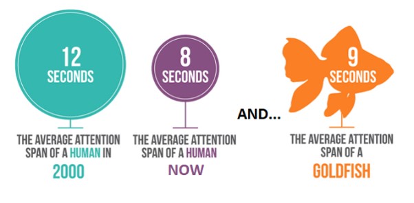
If you want your users to have a great experience, you literally can't afford to keep them waiting.
Instant gratification is the name of the game and if you’re not willing to provide that, your customers and their conversions are going to move the competition. Quickly.
Your pages should be fully loaded in less than three seconds.
To help you succeed, here are a few easy things to focus your efforts on:
- Compress and optimize your images
- Make sure none of your links are broken
- Ensure your pages are optimized for mobile browsers. Mobile browsing is the future after all
- Cache your web pages
- Eliminate unnecessary plugins, no matter how cool they sound
There are a bunch of tools that you can use to check your page speed through various platforms. Google's PageSpeed Insights is the most notable one. Simple, easy to use and helpful when it comes to analyzing a problem as well as providing possible solutions, it’s definitely worth adding to your arsenal.
Final Thoughts
Ultimately, websites with high conversion rates provide their users with a consistently good, fast, and engaging experience.
If you want to sell a product or a service online, educating, informing, inspiring and entertaining your users is vital. Doing that means you not only need to have great content, but you also need to have a design that accentuates and lifts it.
Clean, effective, and frictionless design will be what determines how users react and interact with your website.
Great design sells and keeps customers coming back.
Shabby and inconsistent design on the other hand, will have users hitting the back button and never coming back. No matter how brilliant you, your services or your products are.
More from CodeDesign
1. Codedesign is a digital agency specializing in creating innovative and creative solutions for our clients.
2. Our experienced professionals are dedicated to helping our clients succeed in their digital goals.
3. With our cutting-edge technology, proprietary tools and creative strategies, we ensure that our clients get the most out of their digital investments.
CodeDesign is leading:
- Digital Agency
- Digital Marketing Agency
- Amazon Marketing Agency
Feel free to contact us to see the unprecedented growth of your business.

Add comment ×