4 min to read
The number of PPC Ads has increased year on year, but the number of people blocking them has also increased. While some people are so use to them being their it is if they are blind to them. So, you must put in the extra work to make sure that the visuals are perfect match for your target audience. More clicks. More conversions.
Structure
The Interactive Advertising Bureau says that display ads need to be “distinguishable from normal web page content and the ad unit must have clearly defined borders and not confused with normal web content.”
Every ad should contain four main components:
-
Your logo or company name
-
A value proposition
-
An image or visual representation of your service
-
A CTA button
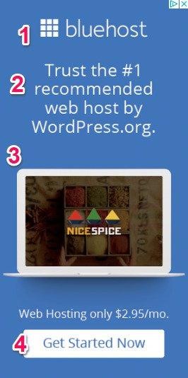
SOURCE: https://www.wordstream.com/blog/ws/2018/07/30/design-principles
Design
Design should be:
- Consistent with branding/visual identity across all platforms. This means color palette and typography.
- Simple. Don’t go crazy with images and graphics. Be creative, but stay formulaic.
- Have contrast. The eye should be drawn to the Call to Action, so use a color that stands out from the rest of the banner.
- Legible. It should be easy to read the text if you are scrolling past on a mobile device. Text should stand out, so if you are using an image on the banner, it is best to add some opacity or color block underneath the text.
- Recognizable. A user should be able to understand the context of the ad instantly (i.e. what is your product or industry). Even if a user does not interact with your ad, it should encourage awareness and top of mind.
- Hierarchical. All text should display clear hierarchy. What is the most important piece of information you want to tell the user? Make this stand out.
- Corresponding with the landing page: Top performing ads have a similar experience as the landing page they take users to. This means using similar visuals, keywords, and call to action
Copy
While copy is important, it should not take up too much of the banner space (see Facebook > text to image ratio for more information). Remember that the function of a banner is to entice users to click through to a landing page and take action, so keep it short and sweet.
Use copy to increase Click-Through-Rates
- The more relevant the banner is to the user, the higher the CTR, so use copy that reflects the stage of the customer journey that the user who is seeing the ad is in.
- For example, campaigns that are impacting the top of the funnel users may require more context, and thus more text. You may want to use your ad copy as an opportunity to tell users about your brand and the why (why is what you are offering beneficial or unique). These banners will also use a less committal call to action (i.e. Learn More, Read More).
- Remarketing banners (and especially dynamic ads) may not require as much contextual copy since these will be displayed to users who have already been impacted by the brand. Here, you can make your copy more actionable. This is a good opportunity to highlight promotions, offers, specific products. The call to action should be more conversion oriented (i.e.l Sign Up Now, Shop Now).
Use copy to increase Conversion Rates
- The copy on your banners should be as similar as possible to the copy on your landing page.
- Using the same keyword and language not only creates a higher quality score for Google but removes friction for the client in the conversion funnel.
Google Display Network
Supported File Types
-
GIF
-
JPG
-
PNG
-
HTML5 (only if the Account meets Google’s requirements for HTML5 Ads)
Banner Sizes
Top Performing
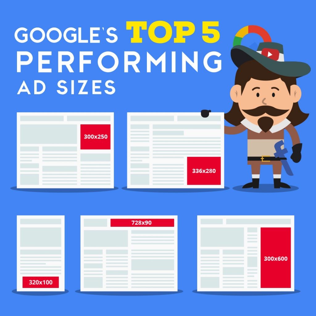
SOURCE: https://adespresso.com/blog/google-ads-size/
While these have been statistically proven to be the top performing sizes, keep in mind that the more sizes you have available, the more placements your ad is eligible for.
Mobile Devices (All)
-
300 x 250*
-
320 x 100*
-
320 x 50
-
250 x 250
-
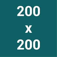
200 x 200
*top performing
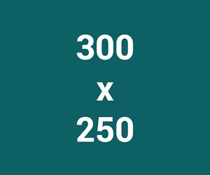
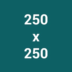
Here are all the different sized templates below


Desktop (All)
-
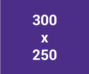
300 x 250*
-
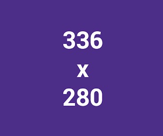
336 x 280*
-
728 x 90*
-
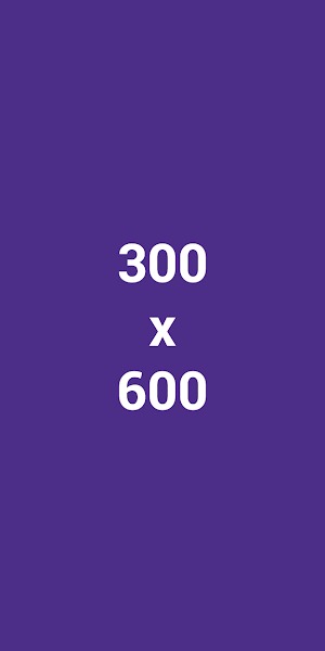
300 x 600*
-
160 x 600
-
970 x 90
-
468 x 60
-
250 x 250
- 200 x 200
* Top Performing
Here are all the different size templates to choose from below


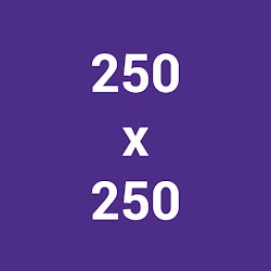
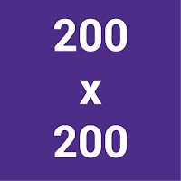


SOURCE: https://support.google.com/google-ads/answer/7031480?hl=en&ref_topic=3121943
Facebook/Instagram
Supported File Types
-
JPG
-
PNG
- Video files (
full list)
Banner Sizes
Common Single Image Banner Sizes
Facebook Feed
-
Square: 1080x 1080 (min 800 x 800)
-
Landscape: 1200 x 628
Instagram Feed
-
Square: 1080 x 1080 (min 800 x 800)
Instagram Stories
-
Recommended: 1080 x 1920
-
Image Dimension
-
Minimum Width : 500 pixels
-
-
Image Aspect Ratio
-
Maximum Aspect Ratio : 90x160
-
Aspect Ratio Tolerance : 0.01
-
All sizes
All Facebook and Instagram Ad Specs can be found in the Facebook Ads Guide: https://www.facebook.com/business/ads-guide/
Text to Image Ratio
Facebook requires that text takes up less than 20% of the banner space. Images with 20% text or higher will experience reduced delivery. To check if your ad meets the text to image ratio requirements, test your banners at this link: https://www.facebook.com/ads/tools/text_overlay
Video Requirements
See full guide to video requirements across different platforms and placements here: https://www.facebook.com/business/m/one-sheeters/video-requirements
Facebook/Instagram
Supported File Types
-
JPEG
-
PNG
-
Video files (full list)
Pin Image Specs
-
File type: PNG or JPEG
-
Max file size: 32 MB (previously only 10MB!)
-
Aspect ratio: We recommend using a 2:3 aspect ratio, or 1000 x 1500 pixels. Pins with an aspect ratio that’s greater than 2:3 might get cut off in people’s feeds
Video at Standard Width (organic or promoted)
-
File type: .mp4, .mov or .m4v
-
Encoding: H.264 or H.265
-
Max file size: Up to 2GB
-
Video length: Minimum 4 seconds, maximum 15 minutes
-
Aspect ratio: Shorter than 1:2 (width:height), taller than 1.91:1. We recommend making your videos square (1:1) or vertical (2:3, 9:16).
Promoted Video at max With
-
File type: .mp4, .mov or .m4v
-
Encoding: H.264 or H.265
-
Max file size: 2GB or less
-
Video length: Minimum 4 seconds, maximum 15 minutes
-
Aspect ratio: Square (1:1) or widescreen (16:9). Note that max. width videos can’t exceed the height of a 1:1 aspect ratio.
Promoted Carousel Image Specs
-
Image count: 2-5 images per Carousel
-
File type: PNG or JPEG
-
Max file size: 32 MB per image
-
Aspect ratio: 1:1 or 2:3
All Sizes
All Ad Specs can be found in the Pinterest Ads Guide: https://business.pinterest.com/en/Pinterest-product-specs
Looking to enter new markets, or need help designing high performing display banners? We can help!
Codedesign is a digital marketing agency helping to connect our clients with their audiences worldwide. We build borderless digital marketing strategies focused on driving qualified traffic, increasing leads, boosting sales, and scaling profits. Contact us to schedule a consultation with of our digital marketing experts.

Add comment ×